


Explore Ashvegas
Tags
art (65)
Asheville (2725)
Asheville Citizen-Times (82)
Asheville City Council (202)
Asheville Police Department (102)
bar (63)
beer (279)
Biltmore Estate (61)
Black Mountain (73)
brewery (153)
coffee (60)
comedy (84)
craft beer (330)
crime (66)
Curate (60)
downtown (163)
Esther Manheimer (68)
featured (1728)
film (114)
food (264)
French Broad River (64)
Grey Eagle (108)
grocery store (63)
Haywood Road (177)
Highland Brewing (62)
hotel (114)
Lexington Avenue (78)
Merrimon Avenue (74)
Moogfest (59)
movie (91)
movie review (278)
music (142)
New Belgium Brewing (80)
newspaper (60)
Patton Avenue (59)
photography (68)
restaurant (242)
River Arts District (167)
south slope (127)
Stu Helm (292)
The Mothlight (62)
The Orange Peel (113)
The Week in Film (85)
UNC Asheville (70)
West Asheville (292)

Menu

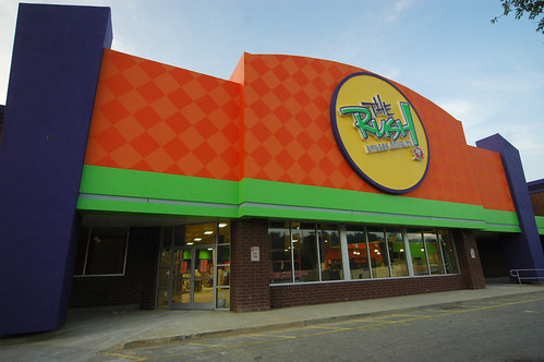
“It’s so 1986.” uggh, my high school graduation year. Don’t retraumatize me! My girlfriend at the time (in South Miami) had previously lived in Asheville. She said she and her friend would go up to that car dealership on Patton and shoot that Indian in the butt.
This building is just fine. I have news for you the strip was already a low before the building came. Asheville used to be such a clean area now its basically full of trash. Clean up and take pride of your self, home, etc.
I’m a big fan of adaptive reuse. Many times old grocery stores and big box stores sit empty. I commend these folks for renovating an existing building instead of clearing, grading and building something filmsy and new and potentially contributing to further sprawl.
and it’s kinda cheery. 🙂
I would say the owner is getting just what he wanted.Free publicity! You cant help but wonder what is that when you drive by.Still ugly though.
Maybe if it was a mural of some epic proportions or maybe a coffee shop then no one would object.
Its their property let them have what ever sign they want.
If they go out of business it would make an excellent hideout for the Joker and his clown goons.
Agreed on the color scheme – who’s their designer?
But as a member, they offer a great facility and great people at a great price.
Ironically their employees / trainers wear all solid black. : )
Tracy, yes, it got my attention. Like the swine flu got my attention.
Julie, good one!
Mel, it IS different.
Who can offord to join a gym right now,no matter how it looks?
My youngest actually screamed when she saw it and said "what’s that ugly building?" I told her it was 1986.
It may not fit in with the rest of the mute boring buildings in AVL, however it got your attention didn’t it?? It will draw far more ppl in then the rest of the gym’s in town.. Especially since they offer so much more..
I kinda like it.
At least it is different from the rest of the boring strip malls that seem to be everywhere.
I like it!
Great marketing and certainly no worse than man of the other buildings in Asheville.
I think it’s far more attractive than the BB&T building downtown.
It’s certainly no worse than most of the rest of the architecture (or lack thereof) along that stretch of Patton. And it’s far better than all the cookie cutter "we want to pretend we’re an Atlanta suburb" crap that’s taking over the south end of town and county.
Definitely ugly!
I wonder why the "sign nazis" haven’t bothered them …. because it seems to me that if the STAPLES sign was considered "a sign" when it was a larger painted area around the word "staples" was/is, it looks like the RUSH would be in a similar situation.
AMEN Ash!!! These are the most foul things i have seen in a LONG time! its awful!
Brilliant marketing however. It won’t go unnoticed and got you talking about it, didn’t they? 🙂
Ugly, yes. But if they can offer good health practice and exercise, more power to ’em.
Then there’s always the YWCA if you really want to work out.